Park Slope Reader Site Redesign
This is my suggested redesign of the Park Slope Reader website. I focused on four main points on their existing website for improvement: the logo, the navigation, the ads, and the articles. Below, I break down each of these sections and how I worked to improve them.
Here is an example of the current website:
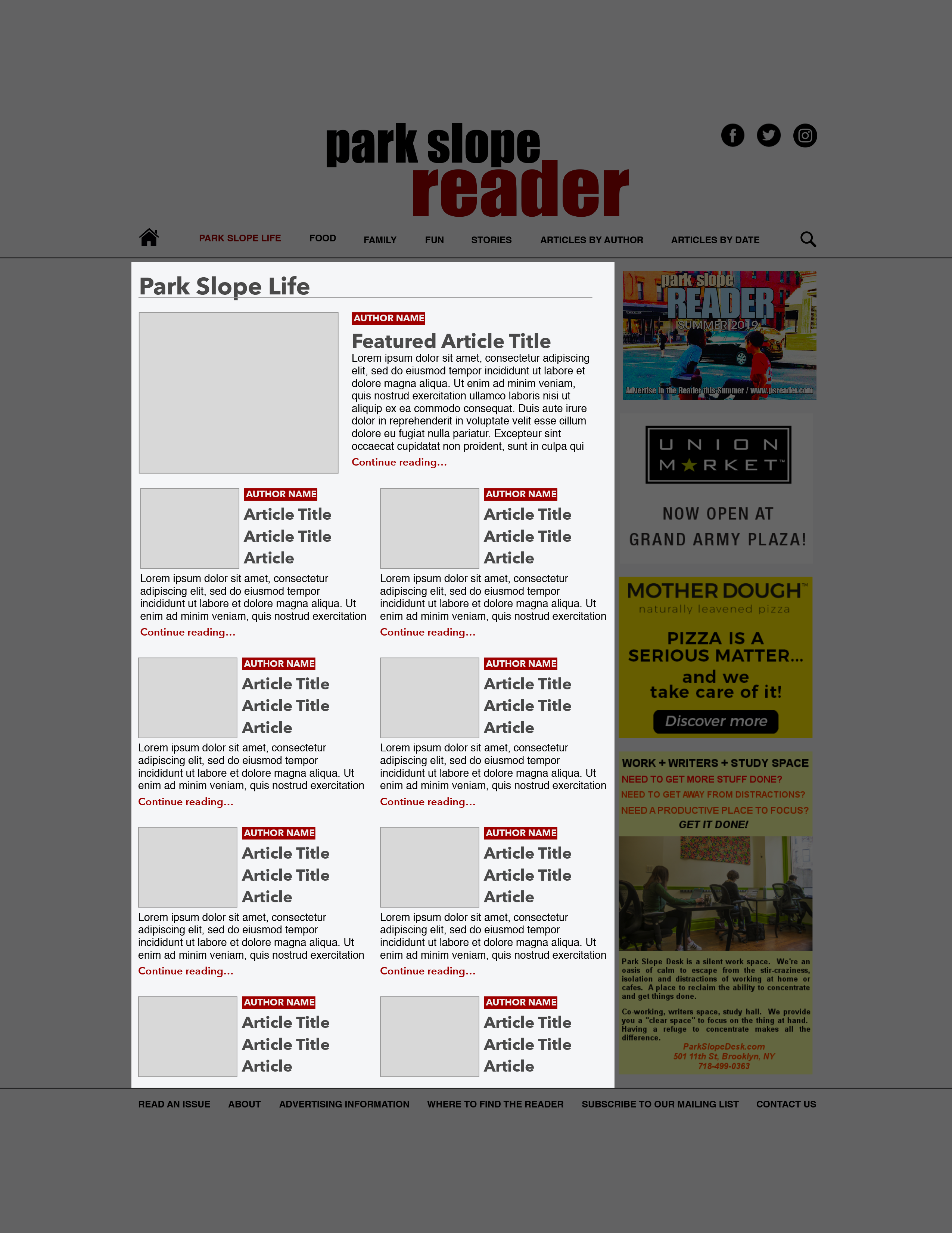
And here is my redesign:
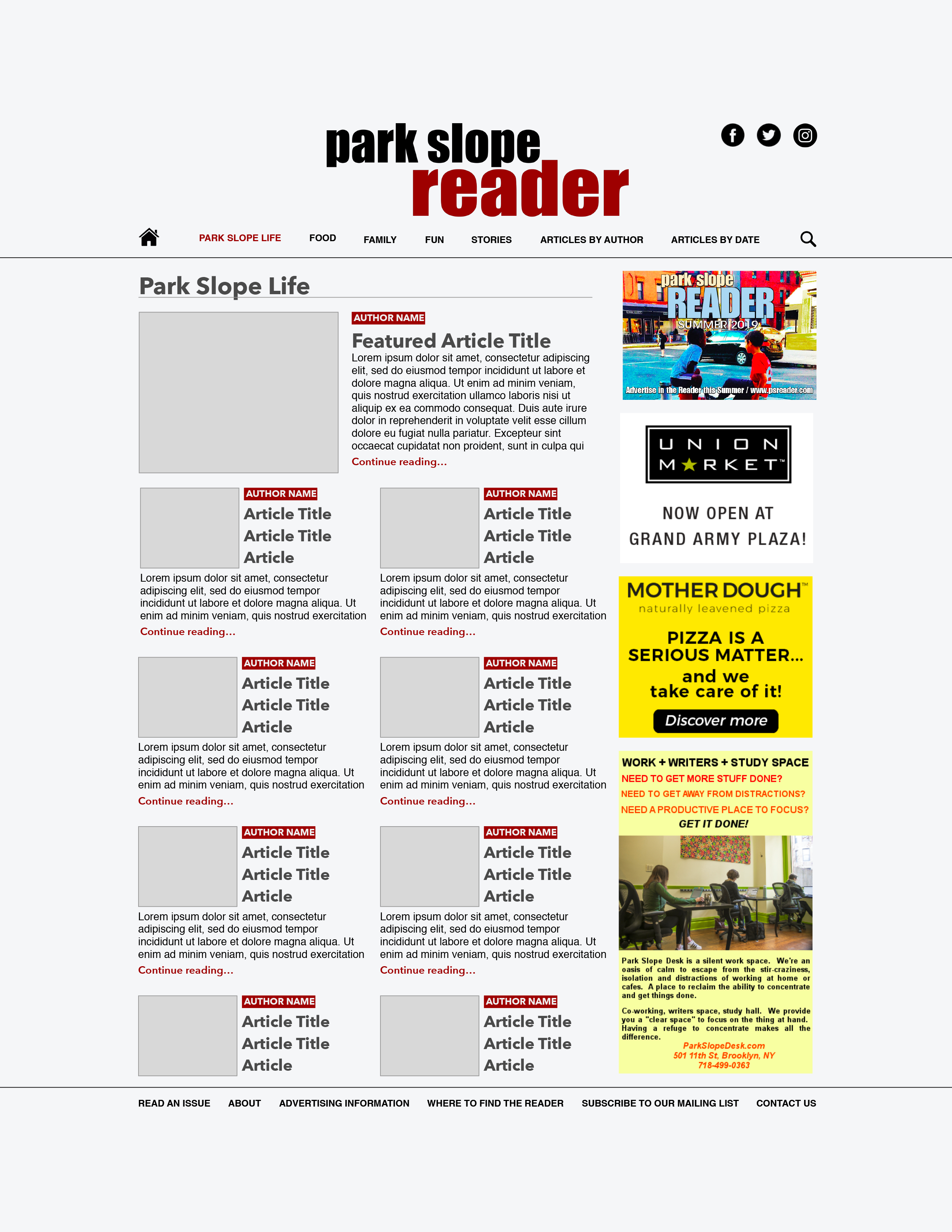
Logo: I took the logo from the original website and repositioned/resized it to make it the most prominent thing readers see when they first come to the site. Now, readers will know exactly where they are and what type of content they're going to see when they recognize a logo they know and trust.
![]()
Navigation: Instead of the article navigation bar containing links to specific articles, I decided it would be best to categorize all articles and sort them into pages where readers would be able to find the specific type of content they are looking for. Additionally, I added a prominent search icon right at the top, and links to search by both author and by date. I added their social media links into the header, so they are accessible and in the same spot for every page.
I realized that the double top navigation bars presented a potential to confuse readers, and decided it would be best to condense the navigation as much as possible. On the current site, the "upper" bar contains links to information that would pertain to a very specific audience: one that would seek it out only if they were interested after perusing the rest of the site (example: advertising information). Therefore, I decided to move these links to the footer, where links like "contact us" and "about" are often listed as secondary navigation on company websites. This keeps the information on every page, but does not take away from the core content: articles, and a way to quickly to access them.
Ads: Advertisements are necessary for funding any publication, and they do need a place on the PSR page. However, PSR's content should be more visually accessible than the advertisements. I kept the right-hand sidebar, and dedicated it entirely to advertising. This way, users will be exposed to advertising throughout the website, but will be able to easily discern between the core content and advertising.
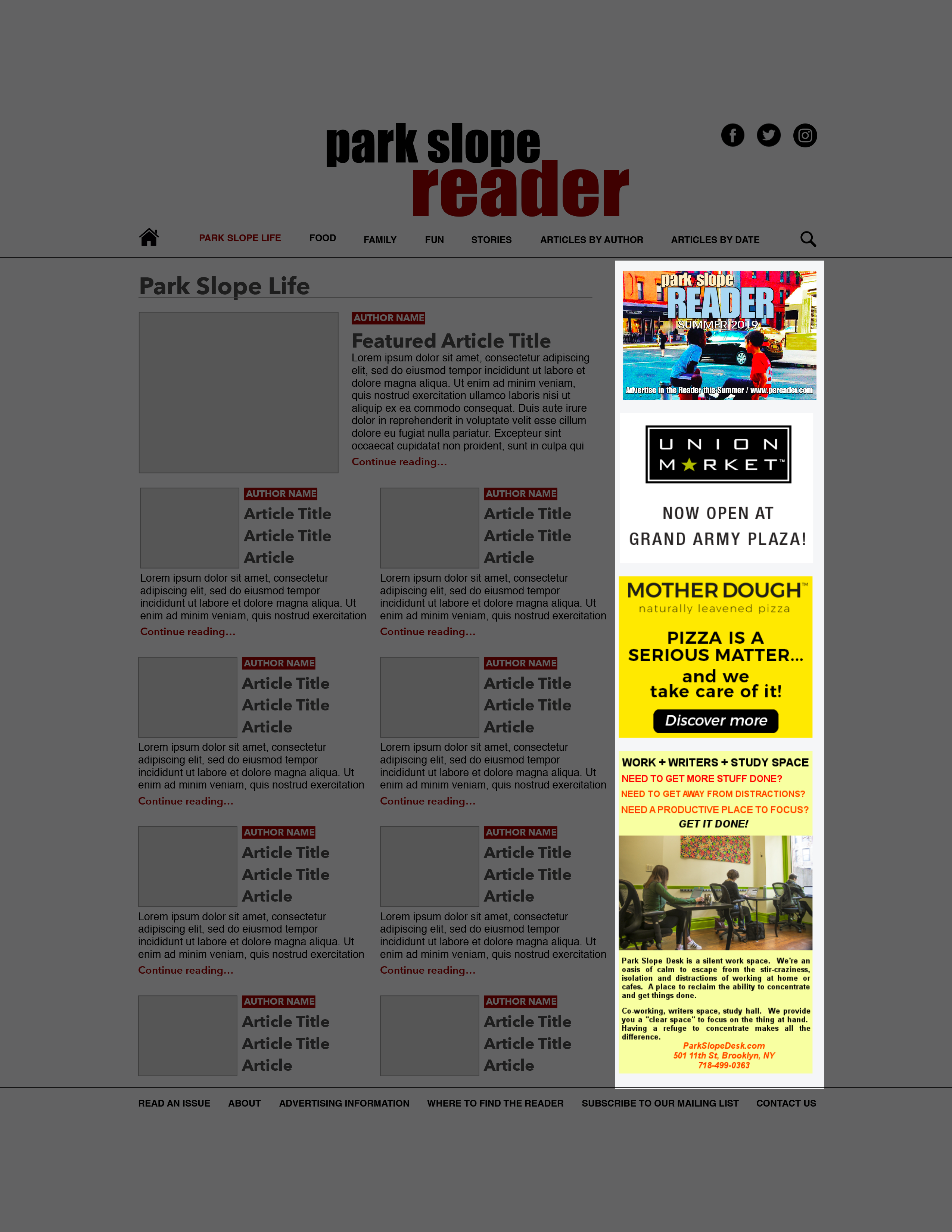
Articles: I tried to condense all major information pertaining to highlighted articles into previews on the main page. Previews now contain an image, author, article title, and a few lines of content. Park Slope Reader seems to really value their author base, and I wanted to feature author names alongside their respective articles.