Pedesis brand identity
Pedesis is a healthcare brand that promotes happy, healthy lifestyles through the recommendation of science-backed methods and products. They approached me in early 2020 to build an e-commerce site selling PPE to both individuals and hospitals.
The project required balancing a trustworthy medical brand aesthetic with a modern, approachable feel — while meeting demanding technical requirements including bilingual content management and bulk ordering support.
I served as a UX researcher and project manager. I led competitive research, facilitated user testing sessions, synthesized findings, and coordinated platform decisions with the client and development team.
The client had clear brand aspirations: the site needed to feel trustworthy, caring, science-rooted, and modern. They wanted a healthcare palette without feeling sterile or overly clinical.
Functionally, the requirements were demanding: cross-country e-commerce capability, a bilingual CMS supporting both English and Chinese, and the ability to handle both single-item purchases and large bulk orders from one system.
I conducted a competitive analysis of healthcare and PPE e-commerce sites to establish design conventions and identify differentiation opportunities.
Blue dominates healthcare branding for its associations with calm, trust, and reliability
Non-Amazon platforms share similar layout conventions — familiar patterns reduce friction
Traditional elements like serif fonts and sidebars are common across the space
Bulk-order brands typically route customers directly to a contact/quote workflow rather than cart
Shopify and Square were evaluated but both lacked adequate Chinese-language support. Webflow met both the bilingual CMS requirement and the client's preference for a low-technical-skill admin experience — making it the clear choice.
Low-fidelity wireframes were developed and reviewed with the client before user testing. They covered the full site architecture: product listing, product detail, cart, checkout, about, and contact pages.
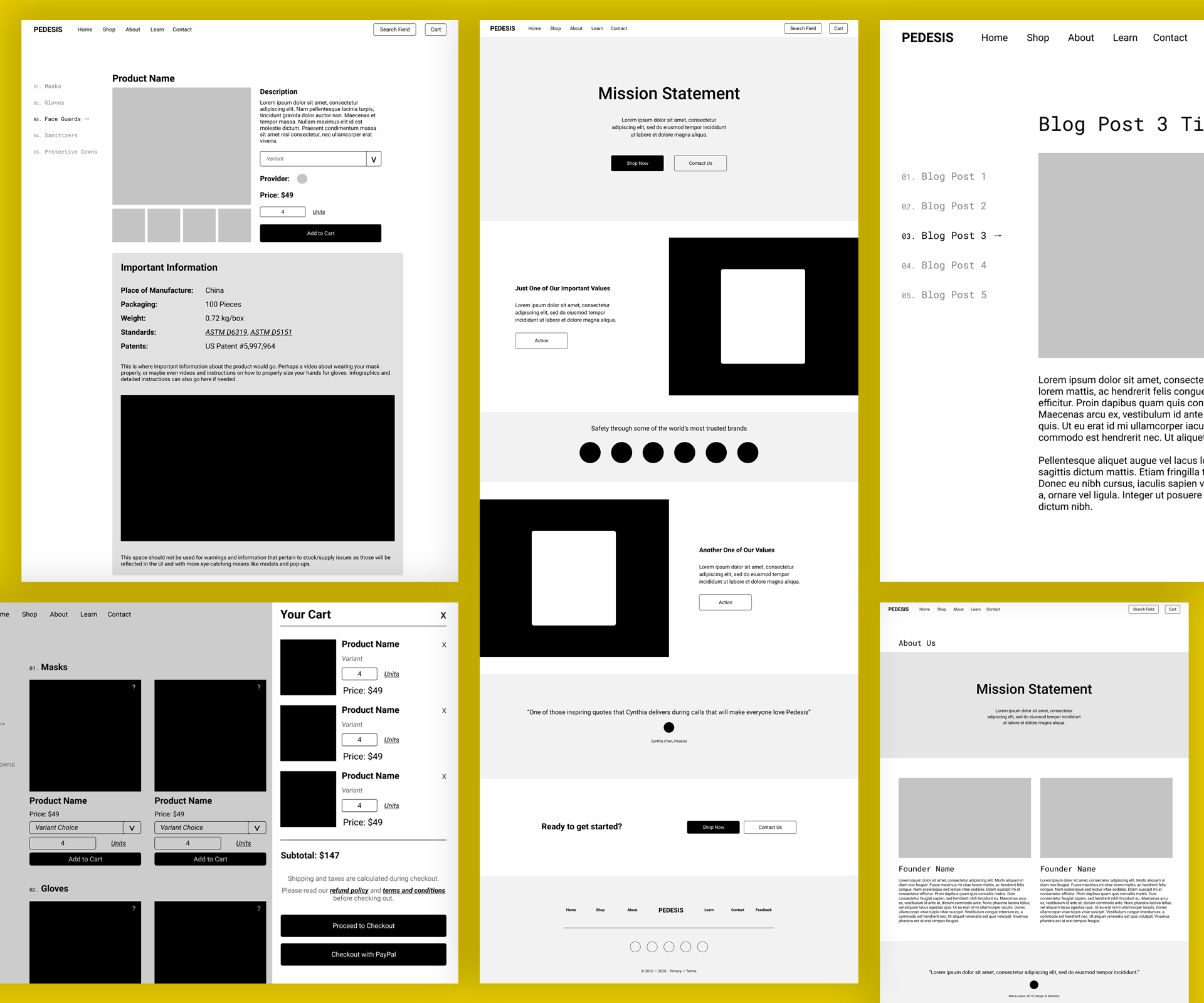
Low-fidelity wireframes used for client review and user testing
Through client conversations, I documented a detailed spec for what product cards and individual product pages needed to surface.
Product image
Quantity per order
Price
Stock count and masks per box / sealed bag
"Information at a glance" summary block
FDA/CDC specifications and MSDN number
Certifications with watermarks and ISO numbers
Sizing variations and additional information
Terms & conditions / no-refund policy
Related Products section and multi-product care package support
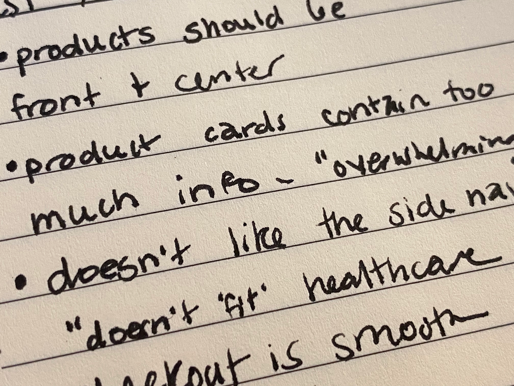
Testing sessions revealed a clear pattern: users were overwhelmed by information density and struggled with navigation. I documented findings directly during sessions to capture nuance.
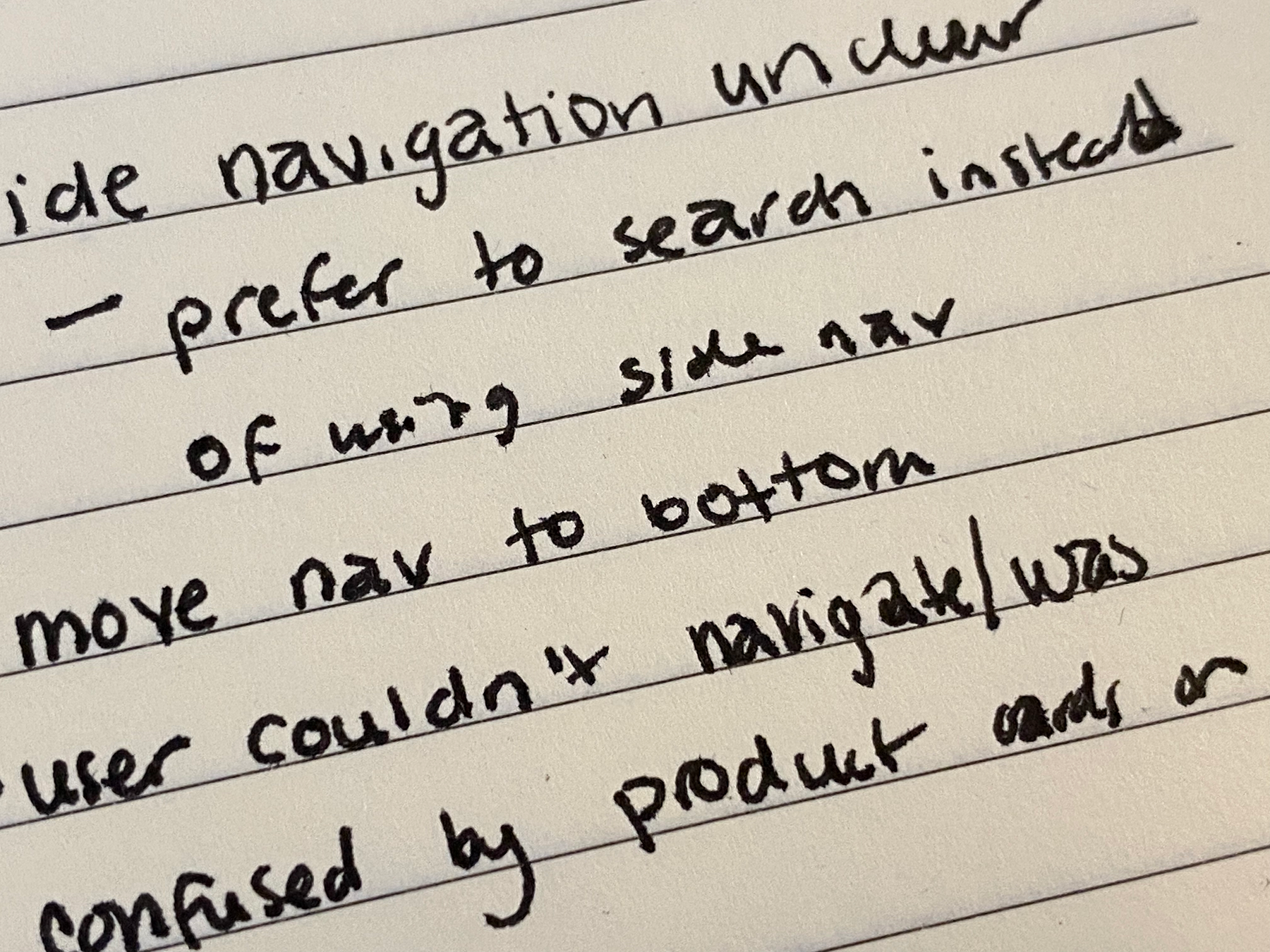
Session notes — navigation issues
Session notes — product card feedback
Product cards had too much information — simplify and move detail to individual product pages
Side navigation felt confusing and visually inconsistent with healthcare expectations
Moving navigation to the bottom improved mobile wayfinding significantly
Search was deemed low-priority given the small product catalog
The final site launched on Webflow with full bilingual support, a streamlined product catalog, and a clean checkout flow tested to work smoothly across devices.
The redesigned navigation and simplified product cards directly addressed the top user testing pain points.
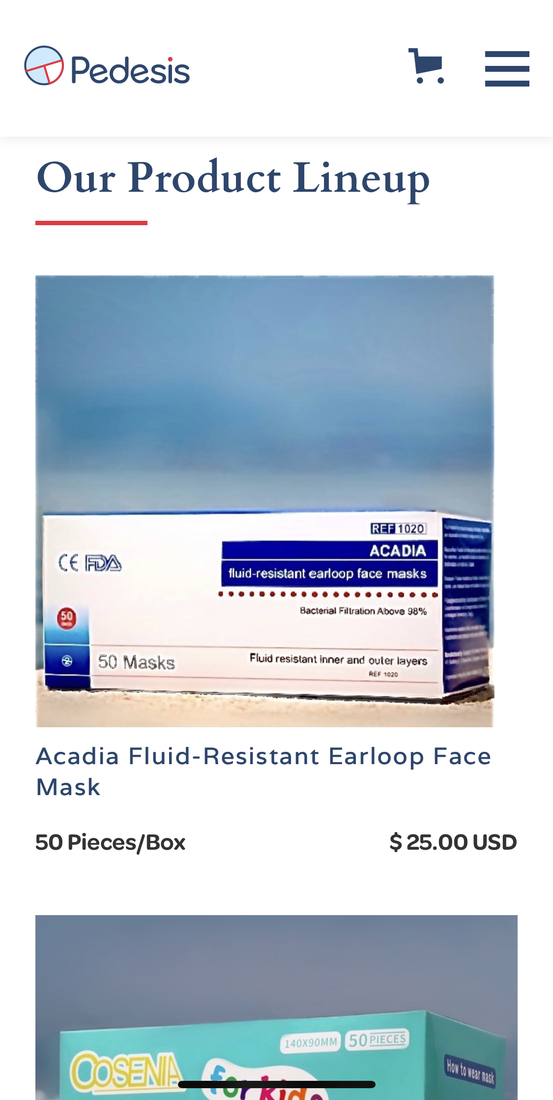
Mobile view
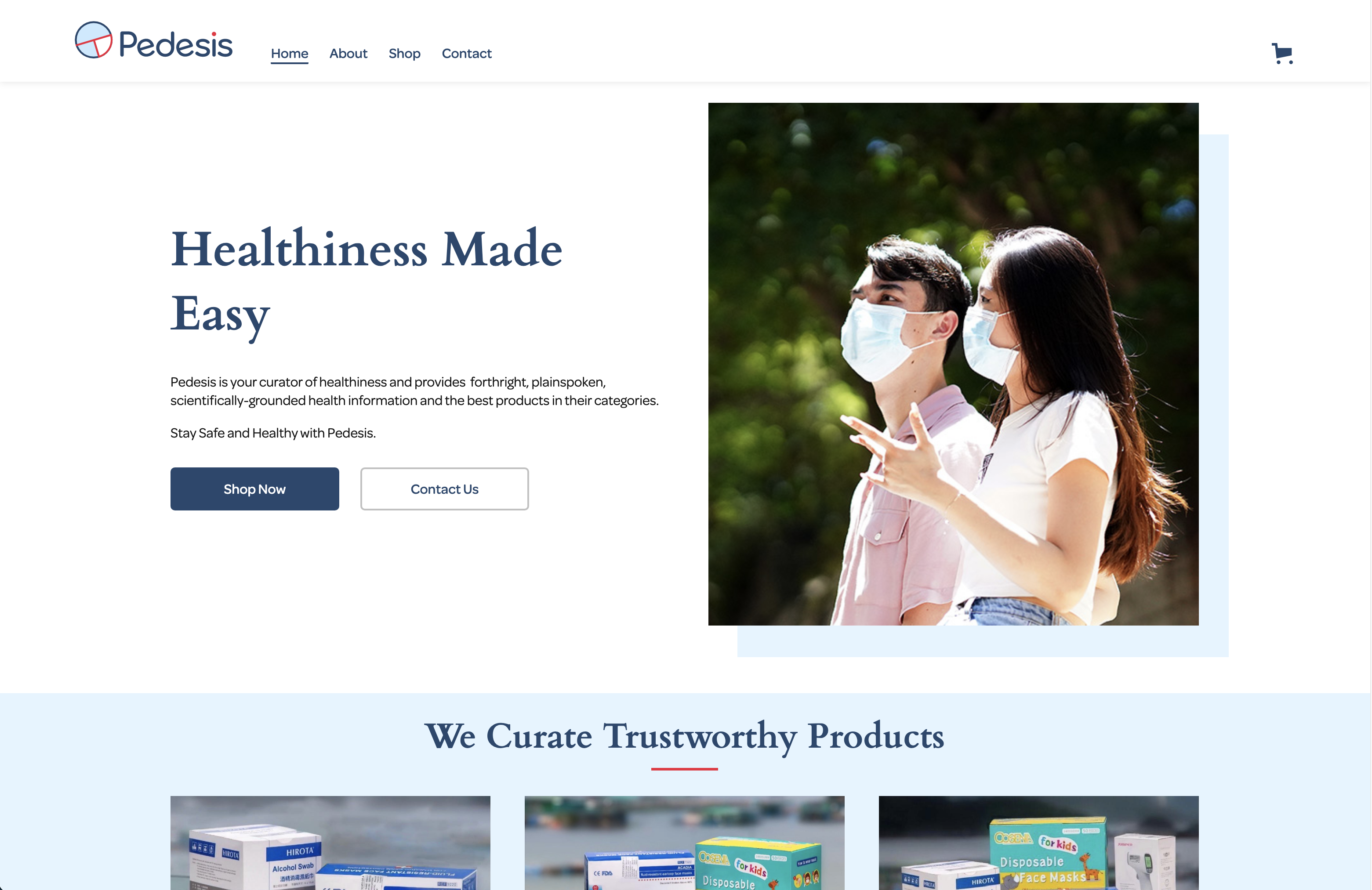
Desktop view